London typos


Top: Retreat Road, Richmond, London; Below: Commit no Nuisance and two London ghost signs, which feature in the book Ghost Signs and Bottom, Launderette, Lewisham (which features in the book Launderama: London’s Launderettes)
–––––
I’ve been aimlessly taking photos of ghost signs, street signs, tube seat designs and launderettes (and other random things too) for decades so it’s nice to see some recent London photography books on the subjects.
Typology – classifying things into types – in photography is nothing new (though it feels its reached its apogee with the internet), with August Sander’s massive project of portraits of German citizens, called People of the 20th Century, dating back to 1911 (unfortunately some 40,000 negatives were destroyed in a fire, leaving only a handful remaining). Bernd and Hilla Becher, also German, continued the tradition with their famous photographic typologies of industrial structures, from water towers to winding towers, arranged in a grid fashion (a format so familiar to us now on websites and phones), which they began in the 1950s.
Artist Edward Ruscha’s various book projects of the 1960s and 70s, including Every Building on the Sunset Strip, a 25-foot long fold out book of LA’s famous strip, were hugely influential in establishing conceptual photography as an art form. Photographer Michael Wolf, who died a few years ago, was a German photographer who lived and worked in Hong Kong. His often amusing typologies include a series of mops, string and chairs found in the backstreets of Hong Kong. But he is better known for his claustrophobic, formal and abstract shots of Hong Kong’s highrise apartment buildings and Tokyo Compression, his project of faces squashed in the windows of over-crowded Tokyo subway trains.
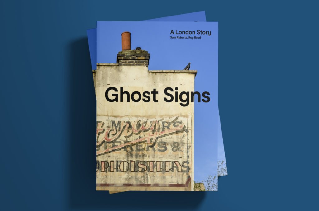
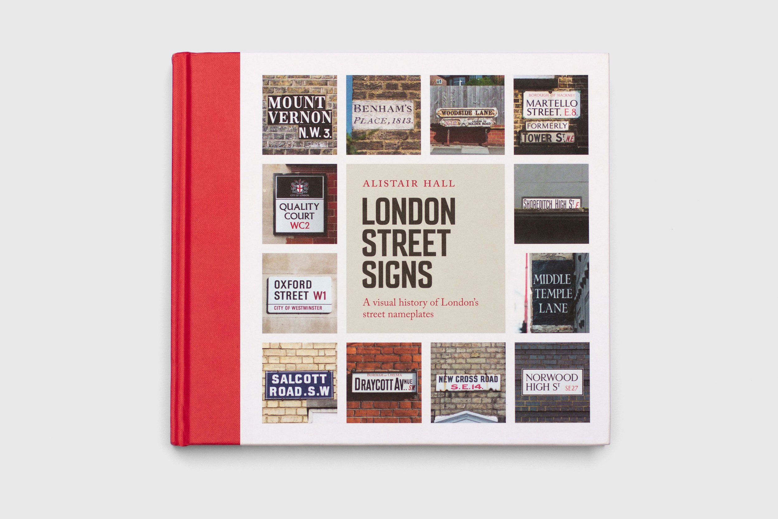
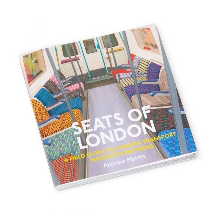
Recent typology photography books of London include Ghost Signs: A London Story by Sam Roberts; Launderama: London’s Launderettes by Joshua Blackburn (published by Hoxton Mini Press, who seem to specialise in typologies, with books on dogs in cars, single dads and urban geometry just a few of their niche titles); London Street Signs by Alistair Hall and Seats of London: A Field Guide to London Transport Moquette Patterns by Andrew Martin (all pictured above).
Other recent London photography books include London in Lockdown, Birdseye London, London Underground, Hidden London, East London Swimmers, Abandoned London and Brutalist London.
The last two titles – Abandoned and Brutalist – have become two hugely popular subjects in recent years. Spurred on by dystopian visions of the apocalypse in films, TV and books, and thanks to the growth of urban exploration, online forums and the likes of Instagram, decaying, derelict or abandoned buildings have become all the rage. Even better if they’re Soviet, Brutalist monstrosities.
The nicher the better, it seems. Who would have guessed Soviet architecture becoming hugely popular in recent years, with numerous, glossy photography books on them coming out. Titles have included Soviet Bus Stops, Metro Stations and Signs and Street Relics.
Photographic typologies are so familiar to us now, from online shops and Instagram feeds (and property websites, and IKEA catalogues, and Amazon and just about everything we look at), we are saturated with images of people or objects repeated in a grid format. From being conceptual art projects to mainstream acceptance has been no small leap, and now it’s all an endless stream of mindlessness.
I’ve been guilty of small-scale typologies, from fire hydrants in Reykjavik and London manhole covers to cigarette packets around the world. More recently I’ve been documenting Cornwall’s engine houses in infrared.
What the font?
There really needs to be a font book called A Typology of Typography.
